Review: Chromebook
Review: Chromebook
After reading this piece by Matt Baxter-Reynolds praising the Chromebook, I bought one just to give it a try. And now, with today’s announcement of the Chromebook Pixel , it’s past time I share my thoughts on the platform. To be perfectly honest…I love it.
Hardware
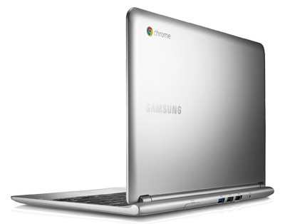
I am using the Samsung 11.6″ Wifi model , which has been the top-selling computer on Amazon for three months now. Perhaps due to the bigotry of low expectations (I expected a clunker), I couldn’t have been more impressed when I took it out of the box. The Chromebook is thin and light, and kind of feels like a plastic version of a Macbook Air (that’s a compliment). The screen is decent enough for a TN-panel, and while I find the keyboard a little mushy, the trackpad was much better than I expected and sadly better than most Windows laptops I’ve used.
The keyboard is customized for a Chromebook, with search in the place of Caps Lock, and a number of useful shortcut keys in place of function key. Ports include USB 3.0, 2.0, HDMI, headphone, SD Card, and SIM slot. It’s an attractive package.
Software
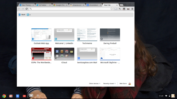
On first launch, the Chromebook launches to a desktop view, not a browser. As you can see, it’s obviously customizable:

In the place of the “Start” button is Chrome, which launches as a windows, not full screen.

I mention such minutiae because I actually think it’s critically important to the user experience: using the Chromebook does not feel strange, It feels a lot like using Windows, and I have no doubt that’s intentional. Google clearly understands one of the fundamental tenets of good design: context matters. In the case of the Chromebook, users are not novices who have never seen a computer, but likely Windows users who have certain expectations of how a computer behaves. The Chromebook accommodates that, and makes you feel at home immediately.
But You Can’t Install Software!
It turns out it doesn’t really matter that I can’t install software. Perhaps it’s because I knew that going in, but the inability to add programs doesn’t feel limiting in the slightest. It turns out nearly everything I use a computer for is easily accomplished in a browser (but for one thing, and we’ll get to that later), and there is no better computer if all you want to do is use a browser.
Stepping back, that sentence is obvious: anything that is custom-made for one thing is likely to be better than something that is general purpose, and so it is in this case. Using a Chromebook feels light; there’s no system overhead, no juggling windows, no worrying about updates. It’s really hard to describe but I’m trying hard, because this feeling of lightness is ever so close to joy and makes the Chromebook delightful.
To be clear, not only does the Chromebook do just about anything I would want to do on a computer, it does so with basically a 0% chance of my screwing something up, or not understanding what is happening. I can only imagine what the feeling is amongst those who are scared of computers.
Oh, and There Is Actually Software
It turned out that the one piece of software I really missed was a notepad. On a whim I clicked open the Application icon, and right in the middle was “Scratchpad.” I opened it up and it was exactly what I wanted, but better. See, it’s a killer notepad, but the backend is Google Docs. It’s a notepad that is available everywhere, immediately. And it works offline, just like all of the other Google Docs apps (and Gmail too).

There are other essentials as well, including a file browser, photo upload, and more, although I didn’t delve too deeply into these.
Chromebook = iPad
John Gruber had a brilliant aside about the iPad a couple of days ago:
Kovach’s whole piece is inane, but the above criticism — that iOS’s home screen is behind because it’s “just a grid of static icons” — is one I’ve seen from other, more reasonable critics. Such a mindset completely ignores simplicity and obviousness as benefits. The utter simplicity and obviousness of the iOS “system”, from a user’s standpoint, is arguably the primary reason iPhones and iPads are so popular. Is such simplicity for everyone? No. Is it suitable for all computers? No. But it is both comforting and comfortable for everyone who’s spent the last two decades more confused than not by their computers.
The utter simplicity of the iOS home screen is Apple’s innovation. It’s the simplest, most obvious “system” ever designed. It is a false and foolish but widespread misconception that “innovation” goes only in the direction of additional complexity.
When it comes to simplicity and comfort, the Chromebook gives the iPad a run for its money. For one thing, everything on the web works. Flash, mouse-centric websites, your bank, everything. It’s better than an iPad in that regard. It has a keyboard, no small thing. And it doesn’t break, is updated automatically, and feels instant. Yet it’s just a browser, and that’s a-ok.
It sounds like you’re sold – can I see your Pixel?
I’m sure it’s obvious that I’ve been rather smitten by the Chromebook, certainly much more so than I anticipated. But no, I won’t buy a Pixel. It turns out I have a DSLR camera, and I shoot in RAW and depend on Adobe Lightroom to import my photos. That doesn’t run on a Chromebook, and never will (for that matter, it doesn’t run on an iPad either). And so, my next big purchase will be a new laptop; 95% of what I will use it for could have been done on a Chromebook, but that 5% is a killer.
UPDATE #1: Scratchpad was unfortunately killed by Google in favor of Keep
UPDATE #2: I bought a Pixel after all. And I love it. More on why in a future post.
文章版权归原作者所有。

